
 GoodNotes
 iA Writer
 iBarcoder
 Final Draft
 EndNote
 Keep It
 LookAway
 Complete Anatomy


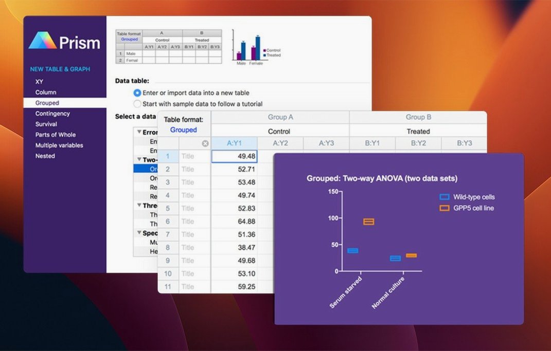
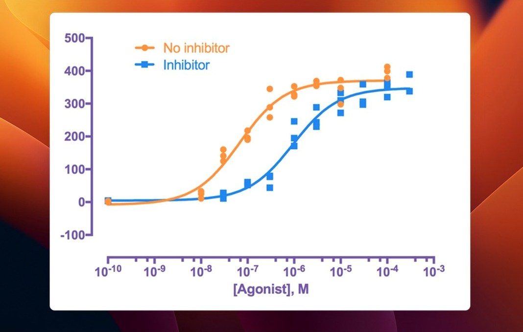
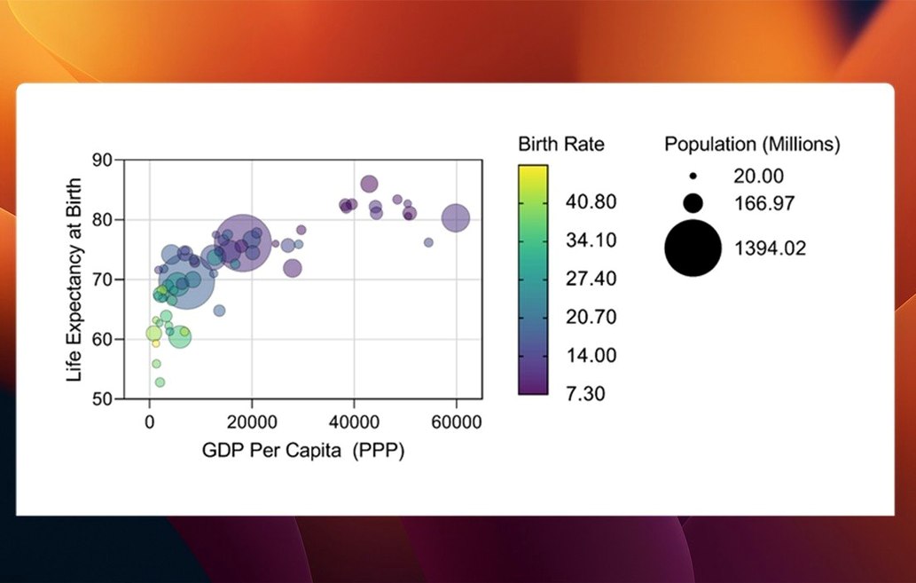
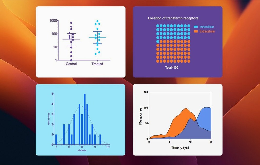
If you have wrestled with Excel's clunky trendlines, Prism feels purpose-built. It's the place where a messy repeated-experiment dataset turns into a clear analysis without switching between three different tools. For this run-through, imagine we need to compare treatment responses across several patient groups and present it as a violin plot — a new graph type in this release.
You start in a multiple variables data table. The 11.1.0 update lets you set a categorical level order directly, so your "Low Dose" group appears before "High Dose" without any spreadsheet trickery. You paste in the raw values, and the linked analysis dialogs now have streamlined variable selection; picking your grouping variable and response column feels more like a single clean sentence than a branching form.
From there, you jump into a one-way ANOVA. Prism runs the non-linear regression checks in the background and spits out the significance estimates. Then you tell it to graph the results. Because you set the categorical order at the start, the new violin plot builds itself with the groups in the right sequence, showing data density and the median in one hit.
You can tweak colours and fonts before exporting. The whole path — from raw numbers to a presentation-ready figure — stays inside one window, with every analysis step recorded in a navigable sidebar. That audit trail is the real safety net when you revisit the project a month later.
Newcomers often treat Prism like a spreadsheet with nicer graphs. They paste data into the first table they see and hit "Analyze" without checking the table type. A multiple variables table behaves differently from a grouped table or an XY table — picking the wrong one from the start means you cannot run the analysis you actually need. The fix is simple: before you type a single value, spend ten seconds on the Welcome dialog and match your experimental design to the table structure Prism suggests.
Another early habit is ignoring the linked data chain. People duplicate a graph, tweak its colours, then later delete the original data thinking the copy will survive. It won't. Every sheet in Prism — data, results, graphs — is tethered together. Delete the parent data table and the graph collapses. The workaround is to use Duplicate Family from the sheet menu when you genuinely need an independent branch. That gives you a new data set with its own downstream analysis, safe from changes upstream.
A stalled nonlinear regression fit is a common frustration. You pick a dose-response model, click OK, and Prism returns an "ambiguous" fit with nonsense confidence intervals. Almost always, the culprit is initial parameter values that are too far from reality. Open the Diagnostics tab after a failed fit and look at the starting values Prism guessed. If your EC50 starts at 1.0 but your data spans micromolar concentrations, you need to give it a nudge. Right-click the analysis, choose Change Parameters, and under the "Initial Values" section, set a rough estimate that matches your data's scale. A bad starting value wastes more time than any other single setting.
Another head-scratcher is the graph that refuses to show error bars you know you entered. You type in your SEM column, select a bar graph, and ... nothing. Prism draws error bars from the data table's designated subcolumns — if you placed your SEM in a column it doesn't recognise as an error source, it stays invisible. Select the data table, open Format Data Table, and under the subcolumns layout, confirm that the column type is set to Mean & SD or Mean & SEM as appropriate. The graph picks it up instantly after that.
Most users learn the Command-T shortcut for switching between data and graph views, but fewer realise you can hold Option while clicking any analysis result in the navigator sidebar. That opens the analysis parameters directly, skipping the intermediate results sheet. It's a tiny gesture that saves a dozen trips to the menu when you are iterating on model settings.
The Magic Wand tool in the graph toolbar looks like a toy, but it carries real weight. Click a bar or symbol on your graph, then click the wand, and Prism applies that exact formatting — colour, size, border — to every other data set on the same graph with one step. It beats manually selecting "Apply to all" from a dropdown every time you adjust a shade.
For anyone who switches between Mac and Windows machines using the same project, the Send to PowerPoint feature respects your layout, but embedding live Prism objects in a presentation can bloat file sizes. A cleaner path is to export as a PDF with outlined fonts, then drop that into your slide deck. The graph stays sharp, and the export preset saves your resolution and colour space choices for next time. To set it once, go to File > Export, dial in your PDF settings, and tick Save as default before you click OK.
Yes, it supports both Apple Silicon and Intel Macs running macOS 11 or later.
It adds bars, box-and-whisker plots, and violin plots for multiple variables tables, along with categorical level ordering.
Yes, it is designed to organise, analyse, and display data from repeated experiments within a single project.














Chat 0
Hop in or make an account to join the chat.
Quiet in here so far. If you have used this build, tell me what the install actually did.